Mind map like a pro
Organize your thoughts, communicate complex ideas, and drive clarity across your team.
Create mind mapFlow through complexity
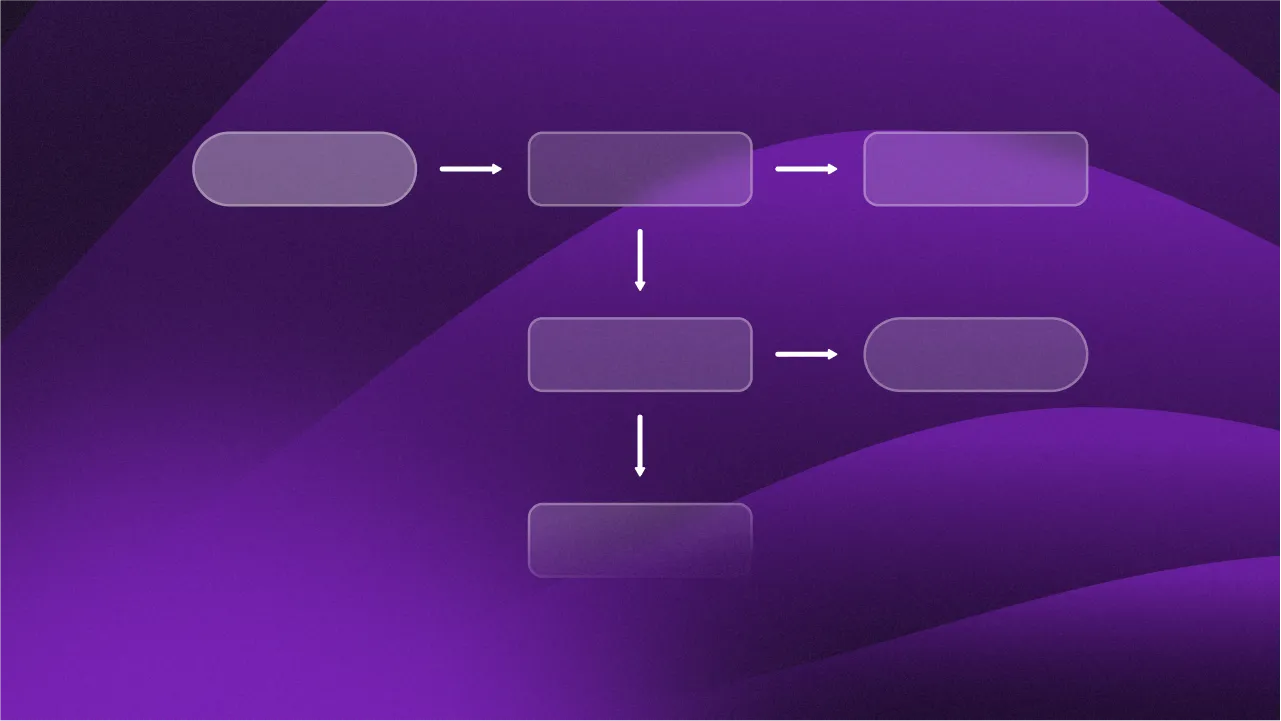
Let your ideas, processes, and information flow freely without running out of space.
Create flowchartStart with a wireframe
Collect feedback, align on functionality, and drive clarity before diving too deep into a project.
Create wireframeDocs that drive action
Help your ideas, features, and improvements actually get built with fast, intuitive product docs.
Create product doc
- whimsical.com/Brainstorm-Session-1
- whimsical.com/Onboarding-Userflow-1
- whimsical.com/Ecommerce-Checkout-UI-1
- whimsical.com/Tables-2-Updates-Pitch-1
Start with AI
Generate mind maps, flowcharts, and diagrams in seconds.
Simple diagram templates
Sign up to see more
Free Mind Map Template
Create a simple mind map to organize new ideas, visualize complex concepts, and more.

Simple Org Chart Template
Outline a shareable org chart that can be instantly updated with just a few clicks.

Free Flowchart Template
Design a flowchart that helps others understand a complex idea, flow, or process.

Basic Gantt Chart Template
Illustrate a simple project timeline and milestones with this basic gantt chart
Complex diagram templates
Sign up to see more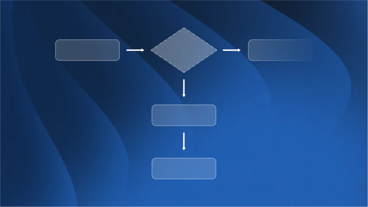
User Flow Diagram Template
Map out user flows for a website, app, or product while collaborating with your team in real time.

Free Process Flow Diagram
Break down complex or branching processes into shareable flowchart.
Simple Swimlane Template
Illustrate how different teams will work together to bring a project or process to life.
Product Roadmap Template
Visualize your high-level product roadmap so that everyone is on the same page.
Wireframe kits
Sign up to see more
Wireframe Starter Kit
Everything you would need to start creating a low-fidelity wireframe for your app, program or website.

Landing Page Wireframe Kit
Use this wireframe kit to turn your messy idea into a viable website, campaign, or landing page.

Mobile Wireframe Kit
Explain how a user will move through your app or website before building a complex mock up or prototype.

iOS Wireframe Kit
Design, iterate, and collaborate on wireframes and flows for your iOS app or mobile website.
Stay up to date with Whimsical
Explore our blog


Product doc templates
Sign up to see more
Simple PRD Template
Collect critical research, context and decisions as you take a product idea from start to finish.

Ultimate Product Pitch Template
Level up your product pitch process with this battle tested template from a Whimsical power user.

One Page Product Brief Template
Write more concise briefs that help your team push ideas forward with this product brief template.

Who, Why, What PRD Template
Outline who a product is for, why you think it should be built and what you want to build.
Expert inspired templates
Sign up to see more
Lenny Rachitsky’s Project Proposal Template
Use Lenny’s go-to project proposal template to effectively pitch your project or idea.

Adam Fishman’s Product Brief Template
Write efficient product briefs instead of overly long and complicated PRDs with this template from Adam Fishman.

Linear’s Product Planning Workshop
Lead better roadmap planning sessions with this template inspired by Linear roadmaping process.

Drew Barontini’s Product Pitch Template
Consistently pitch product ideas from your product team, or whole company, with this template from Drew Barontini.