Introducing self-serve, enterprise-grade Business plan
Darta Rina Turkmena · June 15, 2026




Buried in the footer and sitemap of almost every SaaS website is a strange little world - comparison vs. and alternatives to pages, stretching as far as you can see. Every product claims to be simpler, faster, more collaborative, more flexible, and somehow cheaper too, an infinite hall of mirrors where everyone wins and somehow loses at the same time, depending on whose page you're reading.
We spent an afternoon clicking through comparison pages from some of the most popular collaboration tools. Read enough of them back to back and something strange happens: every product is simultaneously easier to learn than everyone else, more powerful than everyone else, better for enterprises, and somehow also better for small teams. Statistically, this should not be possible. And yet.

Here are the usual suspects we found.
Goldfish memories famously reset every few seconds, and so, apparently, do some comparison pages. Miro's page fighting Lucidchart runs a customer quote calling it "dated and difficult to use, felt like Windows 98".
Then Miro swims one lap around the bowl, over to a different page recommending alternatives to Whimsical, and that same Lucidchart is suddenly “known for its ease of use” with “an intuitive interface” and no “steep learning curve”.
Apparently the competitor is both painfully outdated and delightfully intuitive, depending on who’s asking. Schrödinger’s whiteboard.

Unlike the Goldfish, the Photocopier has a perfect memory. Maybe a little too perfect?
Smartsheet’s pages comparing itself to Asana and Trello present themselves as tailored buying guides. In reality, they open with the same sentence, follow the same structure, quote the same customers, and end on the same closing. The competitor's name changes, but the story never does.
Mural runs a quieter version of the same print shop. Leftover “Lorem ipsum” in the page source and double spaces in headings - telltale signs of a template copied, tweaked, and shipped one too many times.
And then there's also the spelling. Misspell "HIPAA" and "Enterprise" on the page whose entire job is convincing enterprise buyers to trust you, and it's fair to wonder how carefully anyone checked the rest of it.
If you get to write the rulebook, it's amazing how often you win.
ClickUp's comparison pages are a masterclass in home-field advantage. Notion, a documentation tool, loses points for lacking mind maps and video recording. Slack, a communication app, gets scored on project management. Jira, an issue tracker, is marked down for not offering video calls.
There's an old line about judging a fish by its ability to climb a tree. This is that, page after page, with ClickUp insisting apples and oranges are the same thing.
Some comparison pages bend the truth, but the Liar skips straight to making up things that are objectively, verifiably false. Look at Mural’s comparison with Figma. It claims their competitor doesn’t have GDPR compliance or TLS 1.3 encryption.
Figma. One of the largest SaaS companies in the world. Used by companies whose legal teams have legal teams.
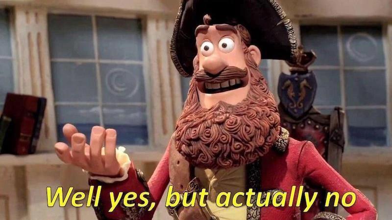
Yeah, we don't think so either.
Next time you land on a vs. page, take a minute to identify the species. It's always one of the four, so consider this your spotter's guide.
Whatever we call them, they’re all symptoms of the same race. One company discovers that comparison pages rank well in search, the next company copies them, then the next, until the whole category is churning out pages that all reach the same conveniently self-serving conclusion, it’s just a marketing wheel spinning on its own momentum, no one steering, everyone convinced everyone else knows something they don't. They’re never about helping you choose the right tool but all about occupying as much internet real estate as possible, hoping search engines and AI assistants alike will faithfully repeat the version of the story you wrote yourself.

We choose not to join this race of faux marketing. Whimsical doesn't have a comparison page, and we're not going to build one on principle.
We would rather spend that time making the product better and clearer and let it speak for itself.