Creating a fast, familiar writing experience in Whimsical
The importance of text
Whimsical allows you to easily visualize what you want to communicate, whether you’re jotting down ideas in a brainstorm, outlining a project proposal, or just making sense of your thoughts. Text is a key part of this experience, which is why we took a lot of care to ensure the writing experience in Whimsical (from sticky notes, to table cells, to flowchart shapes) feels right. So much care in fact, that we built our own text editor.
With full control over text editing in Whimsical, we’ve been able to tailor it specifically for our vision of the app, giving users just enough control over formatting options without introducing opportunities for distraction. In this article, I’ll dive into some of those options, and share how they work together to ensure the writing experience in Whimsical is whimsical.
Building thoughtful constraints
Fewer text styling options
Our users often tell us they love the ‘speed’ they find when working in Whimsical. You can visualize your thoughts, ideas, and ‘messy work’ fast, while still maintaining a level of polish and order in your working file. We’ve made this possible by limiting the number of stylistic choices and combinations a user can choose. This is based on the opinion that too many font, color, and size options can actually produce diminishing returns and distract a user’s focus. Instead, we offer a limited library with just enough variables to create a clear hierarchy quickly. We want users to feel confident sharing their work without having to fuss over formatting.
Purpose-built formatting
Not all objects with text are created equal when it comes to formatting. That’s why we’ve defined formatting constraints for objects that have been designed for specific purposes. For example, wireframe elements that have implied boundaries like inputs and drop-downs.
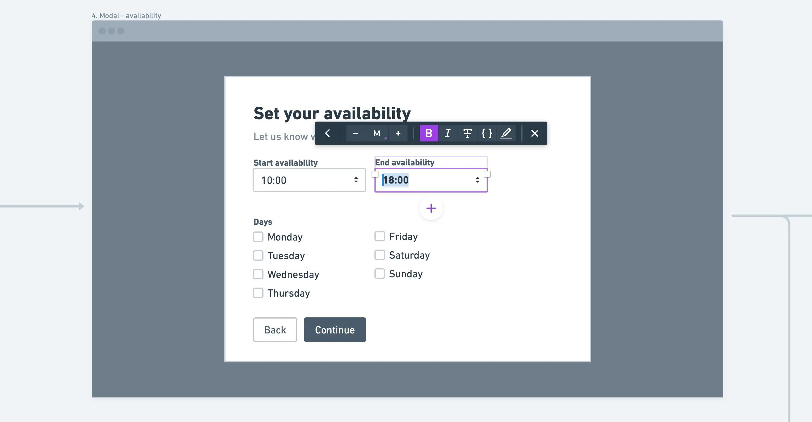
💡 Tip: Use standard keyboard short-cuts to change the format e.g. ⌘ B for bold
Making Whimsical feel whimsical
Similar editing in docs and boards
In addition to balancing constraint and flexibility, we also take care to ensure the experience feels familiar anywhere in Whimsical. As we’ve evolved docs to include more rich text formatting like headers, list items, at-mentions, and highlights, text formatting in board objects has evolved in tandem. For example, flowchart shapes and sticky notes now have updated header styling. This allows users to bring hierarchy into diagrams and notes, the same way they would in a doc.
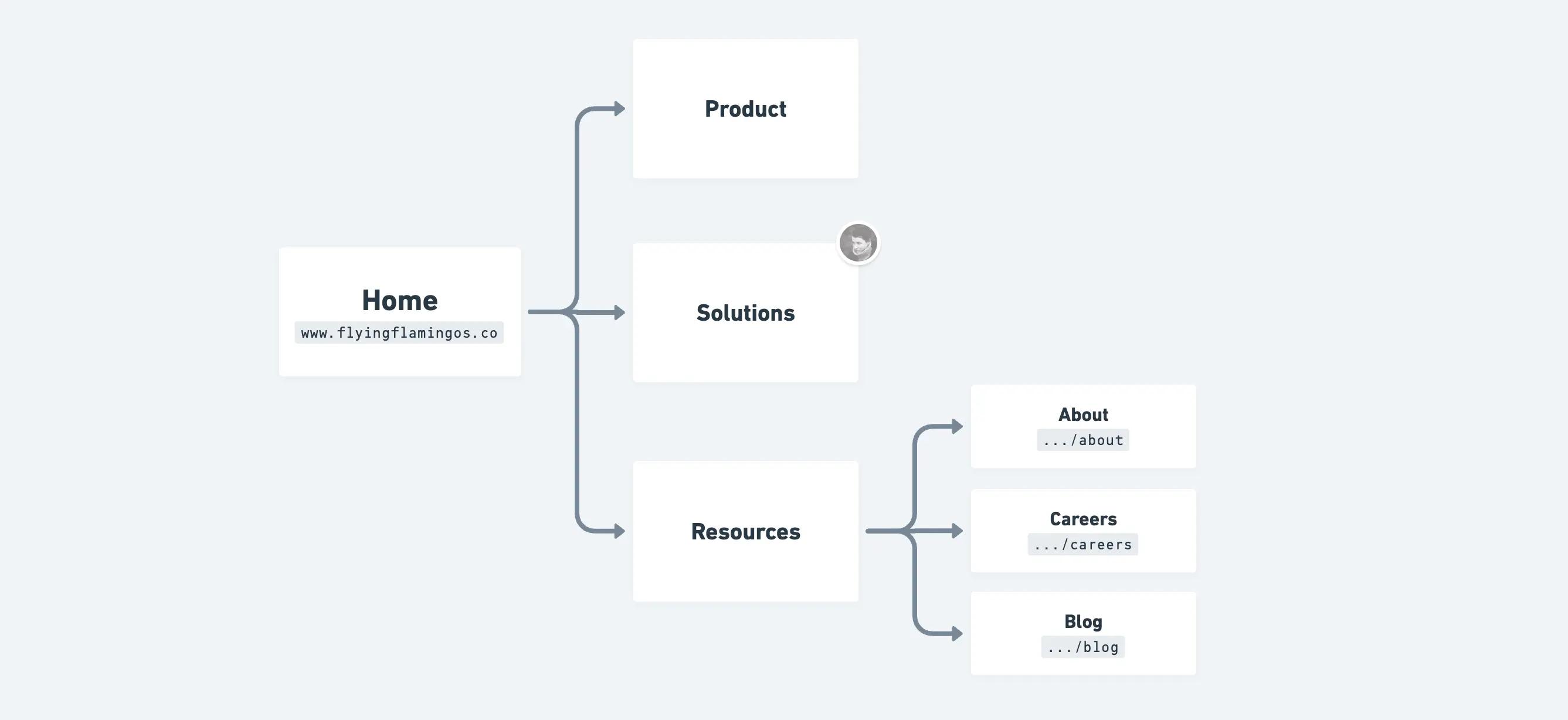
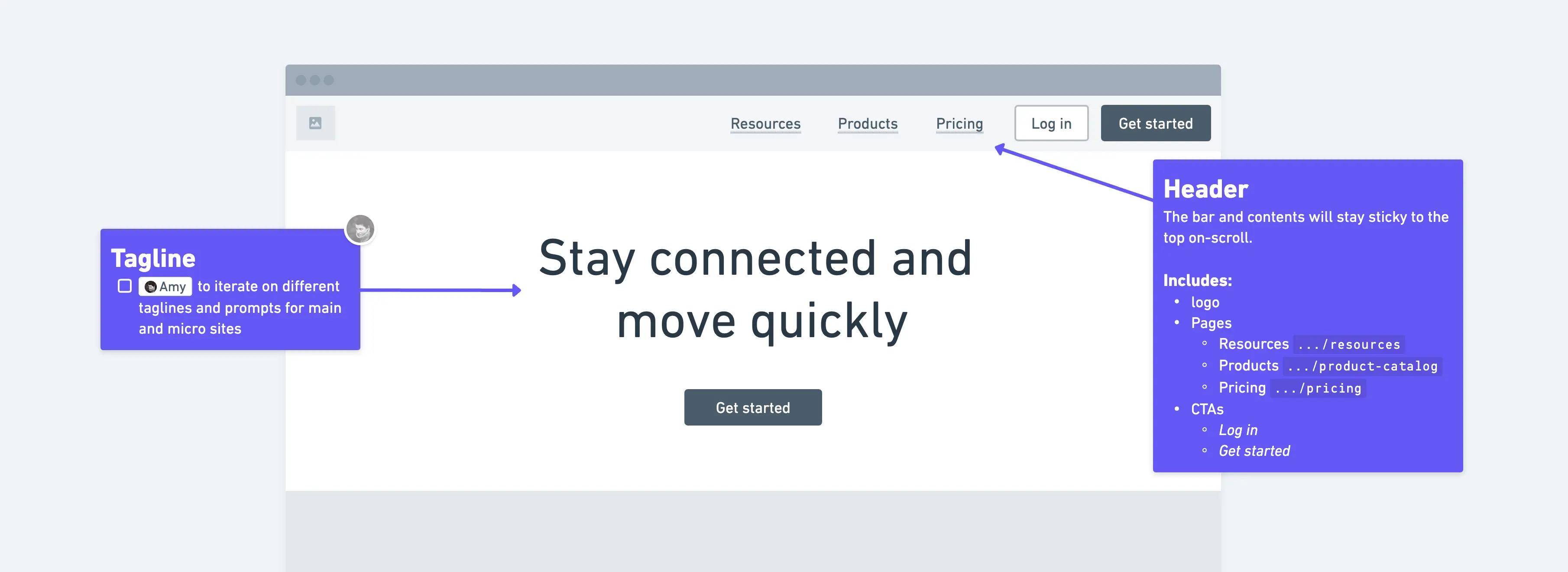
Another example is annotations in wireframe elements. We built annotations to help people document aspects of user flows or wireframes and it has lived with plain text formatting since its inception...until now! Annotations now include at-mentions, list-items, code blocks, and other styling options that allow users to emphasize different aspects and provide detailed feedback.
Mind maps are great for organizing information into a logical hierarchy. The addition of headers, list types, and more text styles creates more contrast and variability in your structure, which makes information easier to read within individual mind map nodes.
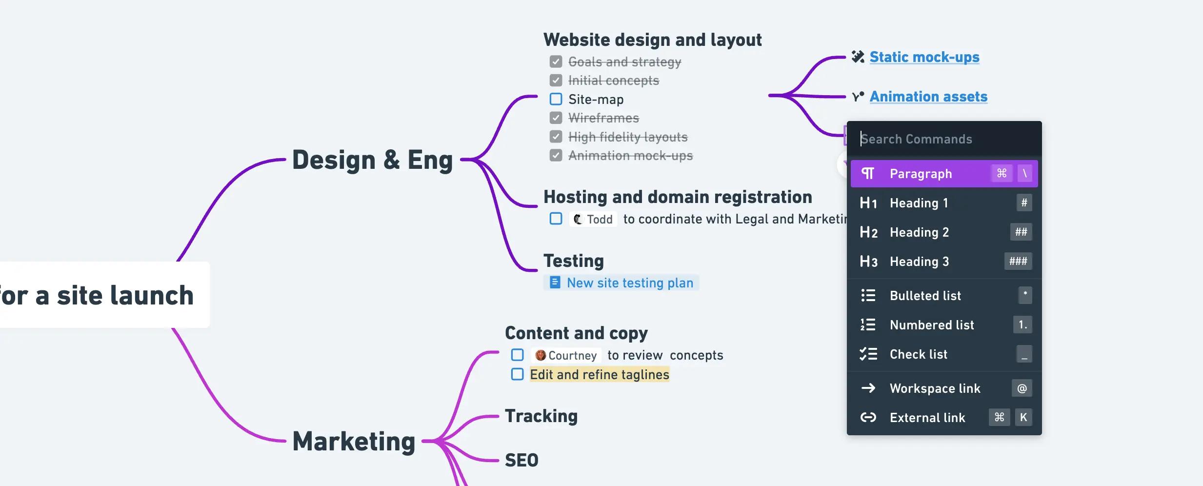
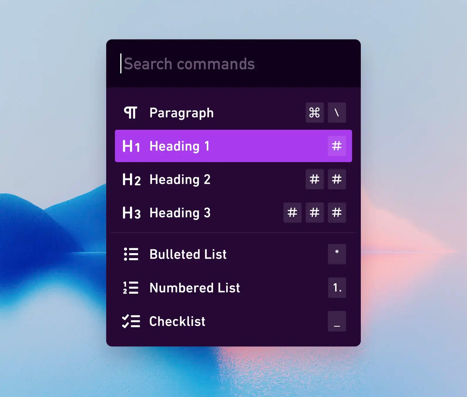
💡 Tip: In a new node or line, type / to view and select your preferred format
Consistent formatting
At the onset of a project, our ideas can be simple and open to change. As you build on your ideas, they take on new shapes and levels of refinement. Copying text from a sticky note (in a board to a doc) should be a breeze, and we want to ensure formatted properties are retained to reduce redundant work. Since we employ standard markdown syntax, formatting such as headings, font-weight, and bulleted list items will format correctly when copy and pasted into other markdown friendly editors.

These are just some of the decisions that went into enhancing our text editing and formatting options in Whimsical. If you’re an existing Whimsical user, we hope these options help you maintain your focus, elevate your thinking, and follow your inspiration. If you’ve never used Whimsical before, try us out for free.
Happy editing 💜

