Sticky notes and new improved boards
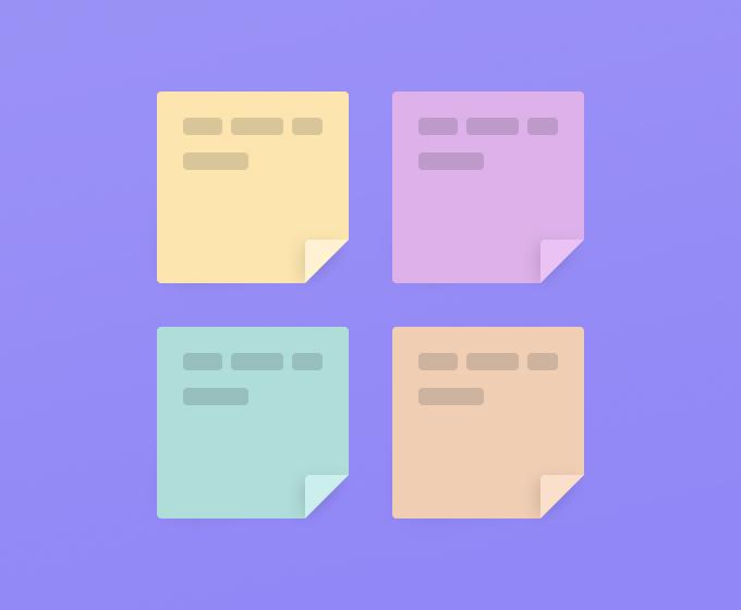
Today, we’re introducing new sticky notes alongside a new board and an updated toolbar.
Sticky Notes
A quick peek into my office and you’ll find that my desk (and the wall next to it) is covered in colorful square sticky notes. They help me think. They help me unload my thoughts. And they’re easy to move around.
Sticky notes have also proven super useful in all the teams I’ve been a part of in the past decade. We’ve been using them for jotting down ideas during brainstorms, prioritizing user feedback, mapping out user journeys, organizing retrospectives, card sorting exercises with customers, seating plans for the office, among many other activities.
The sticky note can be a highly versatile tool in the knowledge worker’s toolbox. It works well collaboratively, between individuals, within teams, across departments, and in collaboration with customers.
The versatility of the sticky note is one reason we now decided to add them to Whimsical. Another reason is that sticky notes are an essential artifact when running collaborative whiteboard sessions—and we do that a lot in Whimsical.
Rich Text, “Quick Add” Buttons and More
We also decided to enrich the already versatile sticky note with rich text formatting (RTF). With RTF you get bold and italic inline styling, the ability to highlight and indent your text, create check lists and bullet points, you can even reference Whimsical files and add external links - all within the sticky note.
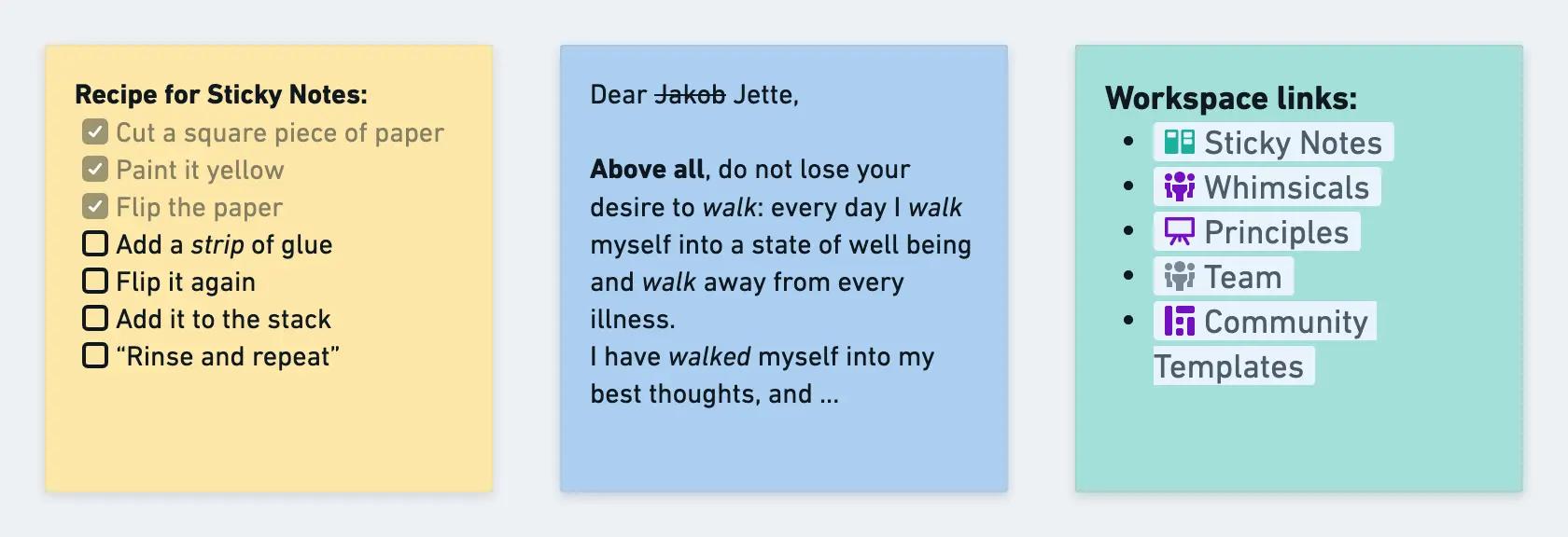
Checklists, inline styling and referencing Whimsical files
With “quick add” buttons we made it extra easy for you to create additional sticky notes on the fly. This can be especially useful when brainstorming ideas in a time-boxed exercise.

Easy peasy, lemon squeezy
Last but not least, the author’s name and avatar are displayed on the sticky note. It can be hidden via the note’s context menu if needed.
A New Board Experience
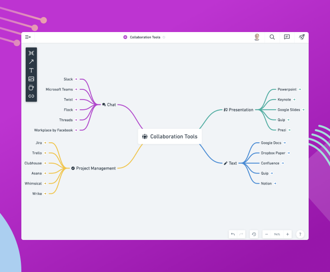
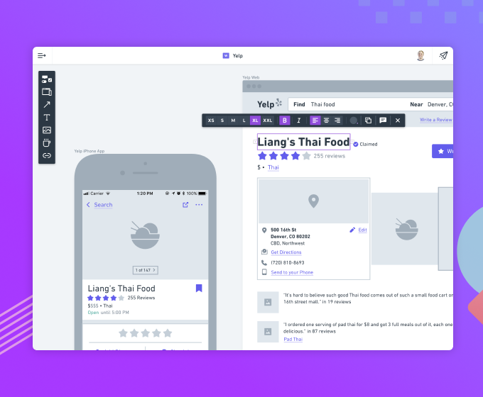
As we’re adding more features and tools, we’re determined to keep Whimsical intuitive and fast to use. That’s why we created a new board mode that puts flowchart shapes, mind maps, and sticky notes at your fingertips without having to switch modes.
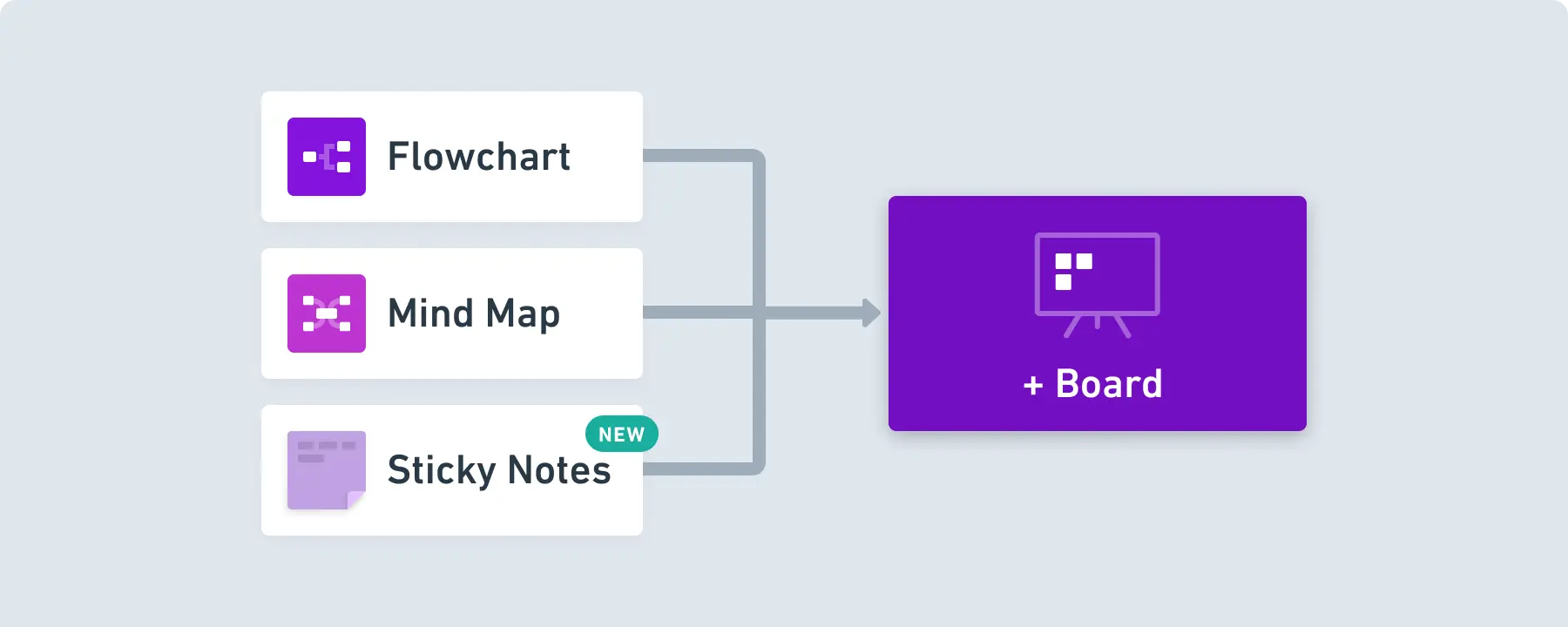
This is achieved through a new and refined toolbar design with a better visual hierarchy. Flowchart shapes, sticky notes and mind maps are at the top, making it faster to get your ideas and thoughts onto the canvas.

Easily drag and drop elements from the toolbar
We hope you’ll enjoy the colorful squares as much as we do—be it in a live session with your friends or asynchronously with colleagues or maybe just all by yourself.
As always, we’re truly eager to hear from you, so if you have any questions or suggestions please reach out.

