Design details that help our users move faster
Todd Moy · October 12, 2023


As we’ve built Whimsical, speed of use has always been a top priority. It’s core to our decision making process and actively guides the trajectory of the product.
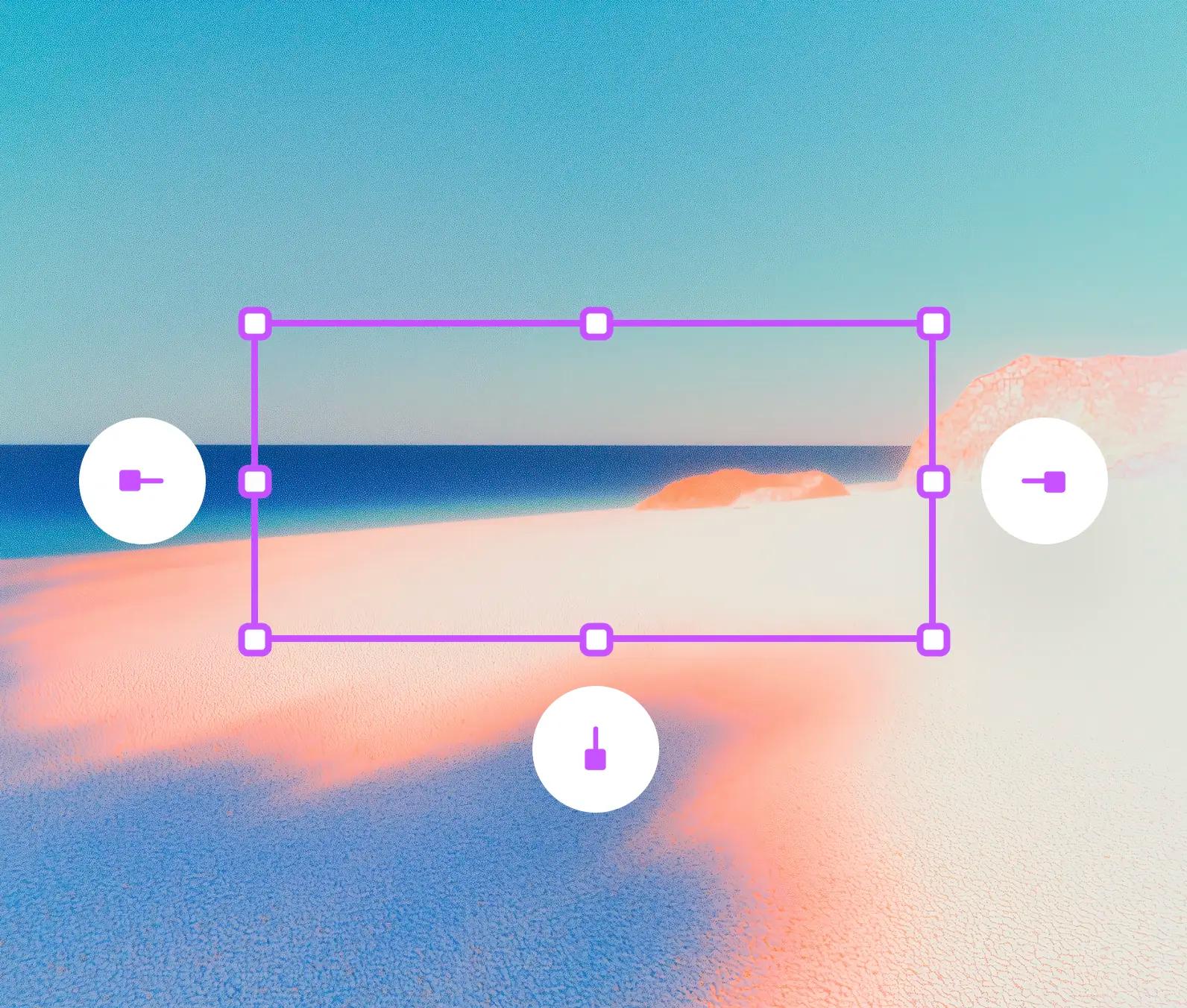
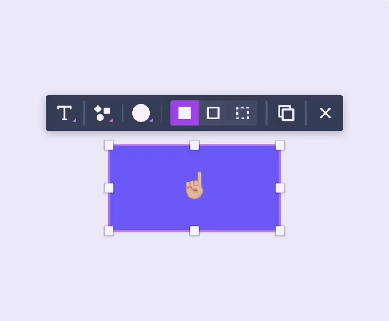
Speed is impacted by a range of decisions. There are high-level structural choices (like using contextual toolbars) that define core interactions and patterns in the app. And at the other end of the spectrum, there are many small, micro-decisions like keyboard shortcuts and auto-focused search inputs that can be just as vital to the overall speed of use. This post is about some of the tiny details that we optimized in Whimsical Wireframes in an effort to create the fastest wireframing app ever.
First, I’ll explain a couple of key insights that led us to these decisions. Then I’ll break down all the details that went into optimizing the shortcuts.
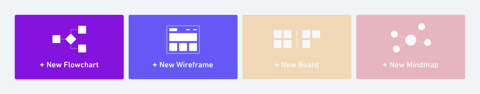
Key Insight #1 – Unbundling the wireframing app unlocks possibilities.
There are a vast number of different activities that can be done on a whiteboard. When bringing these into the digital realm with a visual communication tool, it can be tempting to try to do it all on one board. I mean, that’s how it happens in real life. It’s only logical to replicate this with a digital tool, right?
The problem is that each of the activities is unique. Flowcharts are primarily working with shapes that are connected by lines. Wireframes make use of a totally different set of objects placed within the constraints of device frames like a phone. Sticky notes are yet again unique in the way they are organized and used. When you try to cram all of this into one interface, you are forced to sub-optimize for each use case so that the tool can cover the entire gamut of activities.
We built Flowcharts in Whimsical first. Our focus was on building the very best flowcharting experience possible. When it came time to work on our second product, Wireframes, we made a high-level structural decision to unbundle this app from the first one. The reason we did this is simple. If you were trying to build the best wireframing app that you possibly could, would you start by building it on top of an existing flowcharting app? No. Many of the decisions that were made in that flowcharting app were for flowcharting! It would be like building with one arm tied behind your back.
Unbundling the wireframing app unlocked possibilities. It allowed the wireframing app to be uniquely crafted to that activity alone.
Key Insight #2 – Using wireframe-specific shortcuts is advantageous.
As a direct result of the decision to unbundle the wireframing app and let it stand alone, we were able to operate with much more freedom. We were starting with a blank slate. Our goal was clear and unhindered – just build the best wireframing app possible.
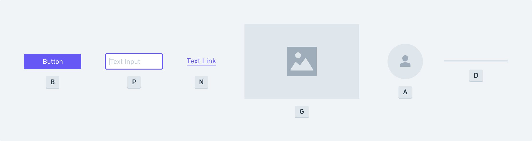
Operating within this freedom, we realized that we could create an entire set of wireframe-specific shortcuts. “B” for button. “A” for avatar. “D” for divider. We mapped the most fundamental and frequently used elements to keyboard shortcuts so that access to them would be immediate. No climbing through nested menus or scrolling through dozens of elements.
Key Insight #3 – Clustering the core shortcuts around the left hand is most efficient.
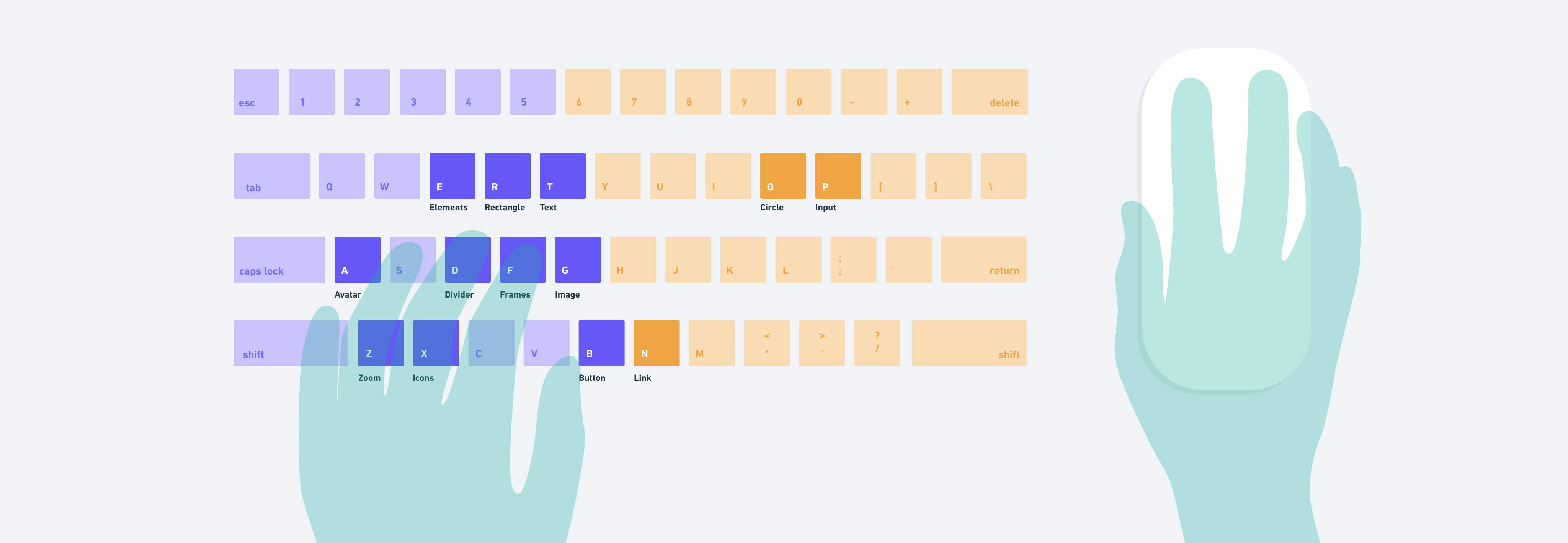
As cool as wireframe specific shortcuts are, we didn’t stop there. We intentionally mapped as many shortcuts to the left-handed keys as we could. The reason we did this is because the vast majority of people use the mouse with their right hand. And when they do this, they typically have their left hand resting in the home position on the keyboard. This means the fastest and most immediate access to the keyboard is with the left hand.
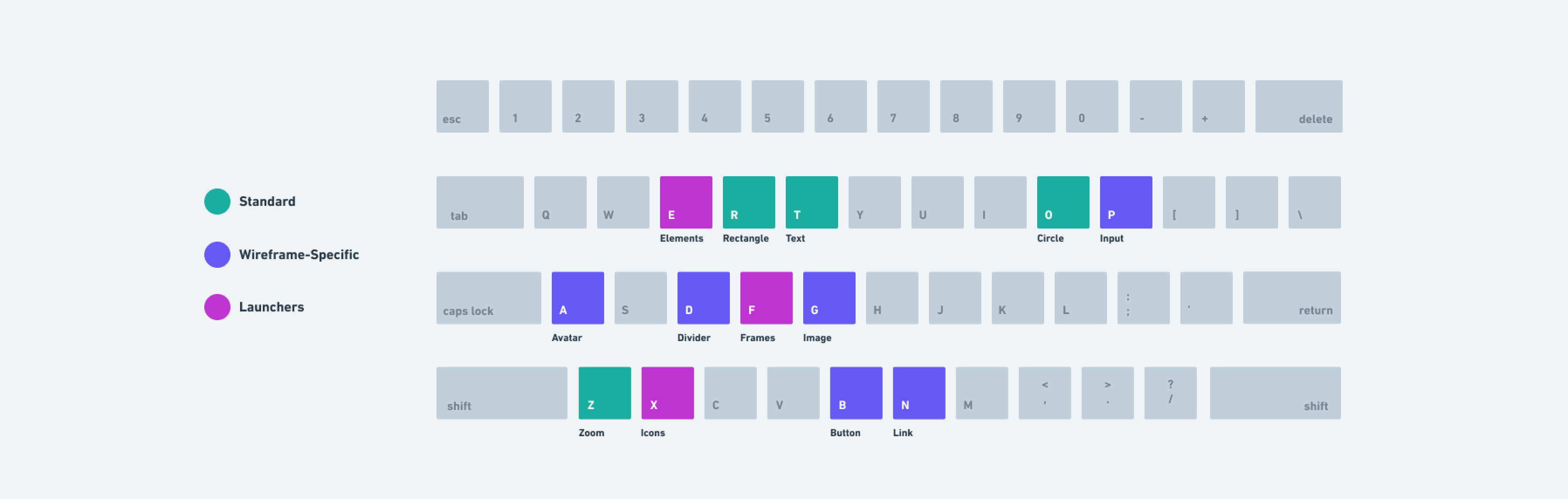
There are three categories of shortcuts in Whimsical Wireframes.
1. Standard: These are the shortcuts found in almost all the design apps and have therefore come to be expected. We definitely wanted most of these to work so there would be a comfortable feeling when people first start using Whimsical and as they continue to use it alongside other apps.
Examples:
2. Wireframe-Specific Elements: These are the shortcuts that are unique to Whimsical Wireframes and map directly to Elements for quick access. Due to isolating the wireframing app and building it unbundled from other use cases, we were able to be really specific and tailored with these. We tried to map them to the most core and frequently-used objects in wireframes.
Examples:
3. Launchers: This last category of shortcuts is even more specific to our app and has some distinct characteristics. Each of these shortcuts opens a menu.
Examples:
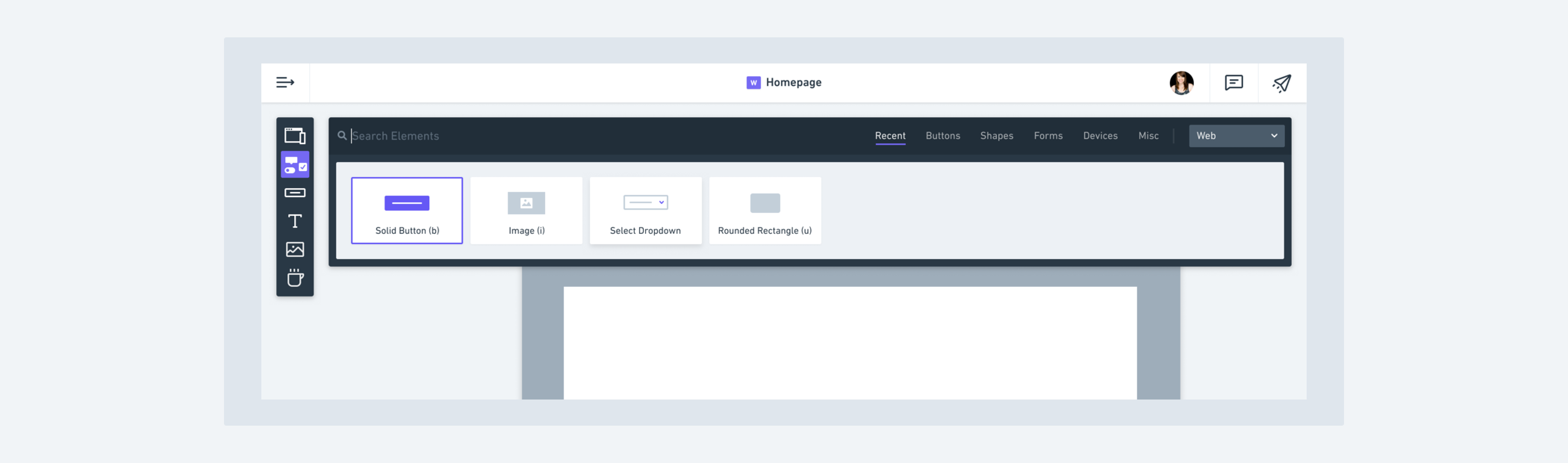
Elements Launcher (e) This launcher is core to the wireframing experience. It opens a searchable and scrollable menu that contains almost all of the main building blocks for wireframes. We auto-focus the search field for this menu so that everything can be done via the keyboard. Each Element has an icon that goes with it so that the list is more scannable.

There were two main modifications we made to this menu as we iterated on it.
The first was that our initial menu was laid out horizontally instead of vertically. After actually using it, however, we noticed there were a few drawbacks. Pretty much all screens these days are a good bit wider than they are tall. So there’s quite a bit more available screen real estate on the sides. Placing the Elements menu horizontally covers up a lot of the working space when it’s open. Not only this, but the horizontal orientation doesn’t scale or handle overflow as gracefully. Horizontal scrolling isn’t typically a great experience and wrapping to a second line would mean taking up even more screen real estate. Additionally, most of our existing patterns around our menu bars kept everything to the left-hand side of the screen. Placing this new one across the top felt a bit inconsistent with that. (👇🏼 old version, 👆🏼 new version)
The other more minor modification we made was to the order of the elements. Initially, we changed the order based on which element had been most recently used. We figured this might make access even faster if you were switching back and forth between the same couple of elements. What we found, though, is that it was a bit disorienting to encounter a different order to the elements each time you opened the menu. And if you were using search, it was mostly irrelevant anyway. So in the end, we kept the order fixed and thus more predictable.
Frames Launcher (f) The frames menu is launched by tapping “f” and offers a list of six different frames (Sketch calls them “artboards”) that can be used. In order to make the frames menu accessible completely from the keyboard, we assigned numbers to each of the frames. This also allows you to memorize a frame type that you use a lot so that you can add a new one without even looking at the menu (for instance, F → 1 for a Window frame).

Icons Launcher (x) The icons launcher is almost identical to the one in Flowcharts. You can launch it with the “x” key and like the elements menu, the search input is auto-focused. Combine this with extensive meta data on the icons and you have an extremely fast, searchable, and mouse-free icon experience.

When it comes to speed, small details can make or break the experience. We set out to build the fastest wireframing app possible. That means thinking broadly about the primary interaction patterns but also zooming all the way in to optimize the tiniest details – right down to mapping the most important shortcuts to the left side of the keyboard.