Doing more than one thing
A product strategy lesson from Intercom.

Conventional wisdom dictates that startups should have narrow focus on just one thing. Build one product that solves one problem for one market. Scale it by expanding the product and capture more and more of the market.
I call this the “Specialist Product Strategy”. Considering that startups typically have limited resources and markets they play in often have “winner takes it all” dynamics, it makes a lot sense.
But does it always?
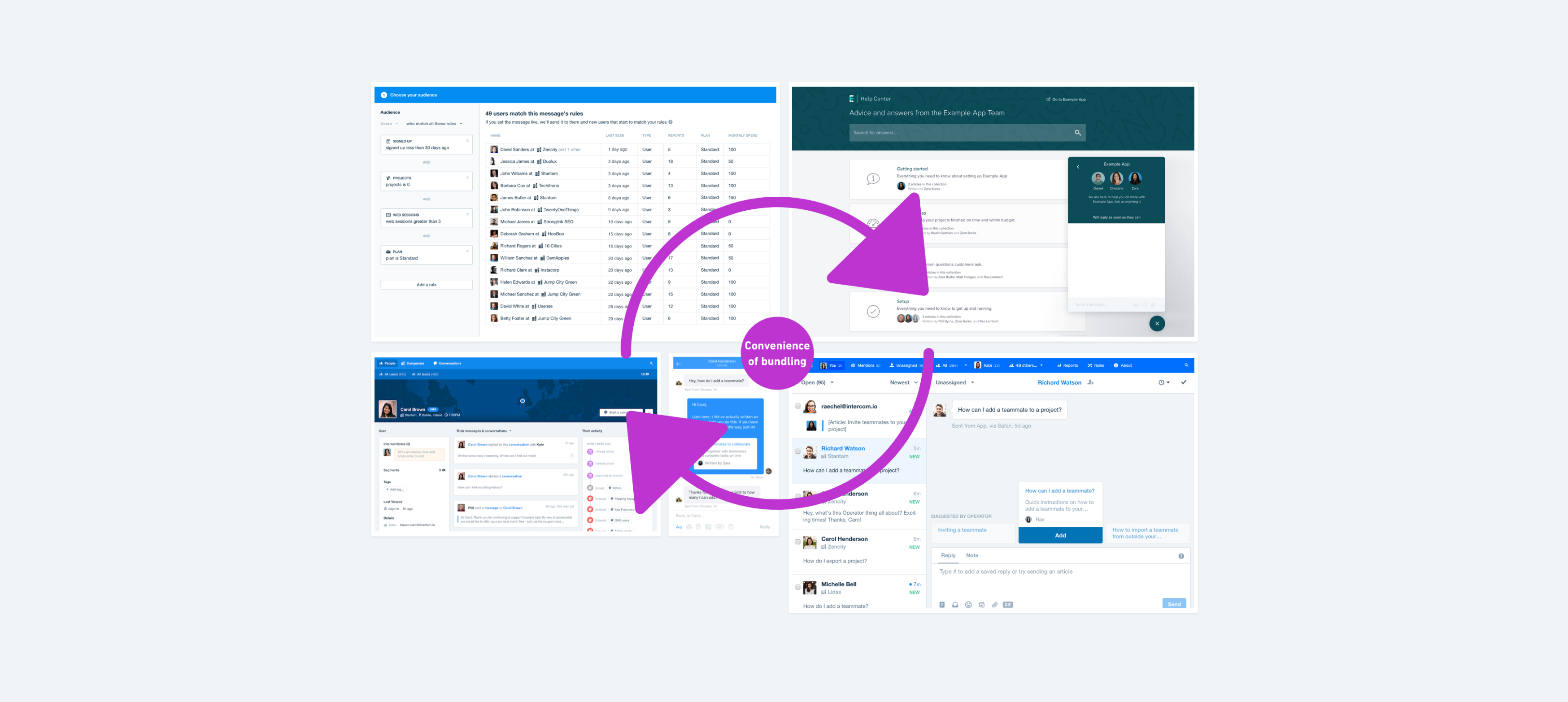
Consider Intercom. It has bundled in-app messaging, email marketing, customer support, knowledge base, CRM, and event tracking all in one offering. Each of these features compete with a crowd of standalone products from companies that do only one thing. They should have failed, right? It’s not surprising initially VCs thought they were crazy. But against all odds, Intercom prevailed and is now one of the fastest growing SAAS companies.
What is their secret then?
Intercom is not the most powerful tool in any one category. If you took just one part of Intercom on its own, such as email marketing, and stacked it up against dedicated products, it wouldn’t look so great. It covers all of the fundamentals but doesn’t give you much else.
What Intercom does give you is the convenience of bundling. You get one customer database with unified customer profiles and communication history out of the box. And you get a unified user experience across all communication channels and contexts. These two aspects save a lot of time, especially if you are a small business. And even when you have the resources to integrate dedicated products, the integration is never as seamless and reliable.

Intercom proves that there’s a big B2B market for simpler but broader and more integrated solutions. This is, in essence, the “Generalist Product Strategy.” Instead of going deep solving one particular use case, you provide more basic solutions to a number of use cases that could benefit from a tight integration in a unified fashion.
That is also the main principle now guiding the Whimsical product strategy. But it wasn’t always so.
There was never a doubt in my mind about the immense value of visual collaboration. I believed any professional today could benefit from it and was obsessed with making that a reality.
The initial thinking was to imitate a physical whiteboard. Following that mindset we built the first prototype but it just didn’t feel right. The user experience felt diluted - you had a lot of creative freedom but it didn’t really optimize for anything. Using it felt like a chore.
So we changed the course. Instead of building one generic product we decided to build several bundled products, each for a specific use case, such as flowcharts and wireframes, but all tightly integrated and with a consistent user experience.
We do not want to be the most advanced solution for anything. That is what specialist products are for. We do want to be the simplest and fastest tool for any visual collaboration use case imaginable, all tightly integrated into one offering with extreme focus on the user experience.


